2015-2017
A profile of every U.S. nonprofit
Designing a page framework to represent every nonprofit organization
The Challenge
Redesigning GuideStar's Nonprofit Profiles
One of the greatest challenges for the nonprofit sector is to clearly define and make understandable the activities and performance of diverse organizations. Historically, nonprofit leaders have struggled to benchmark their organizations, and donors used simplistic financial metrics—like overhead ratios—to judge performance and "impact".
But the nonprofit sector is not monolithic—far from it. The breadth and depth of nonprofit organizations is amazing. And this diversity of organizations presents a challenge, too: different organizations have wildly different data, both in terms of what fields are available for display, and the form of that information.
We started this redesign process by asking nonprofits, donors, and ourselves one question: what matters most when sharing a nonprofit’s story? Moreover, how might we help our users make "better" (meaning more thoughtful) decisions? Lastly, on a technical note, how could we refresh the user experience and under-the-hood performance to deliver a top-notch experience on modern devices?
The other driver: the profile pages hadn't been significantly redesigned since ~2008.
Just like a junk drawer that accumulates bits and bobs over the years, it was time to take a fresh look.
User Research
Interviewing stakeholders
We started user research in 2015, interviewing stakeholders in order to learn about their needs. From internal stakeholders, with their extensive and detailed expertise with IRS tax forms and data practices, along with the Support team's knowledge of common questions and pain points for nonprofits, we learned about the vast range of types of organizations and data types, and their idiosyncratic needs. From external users of the site, including nonprofits, grantmaking foundations, professionals, and the data partners who ingest GuideStar's APIs, we learned about their existing use cases, logistical demands on their time, device realities, and their dream analysis tools.
The overall message was clear: too much jumbled information was confusing, and the profile page needed to be easier to skim, require less clicks, and visualize the data.
Information architecture
Deep dive into the data
In this early stage, I was also spending time getting my own head into the data. The design task was daunting, and required curating a template concept that could incorporate around ~500 possible pieces of data, in various combinations for different types of organizations, that both looked and worked well in different scenarios.
Starting from the spreadsheet catalogue of all of the data, and I began sketching out the different variations along different axes, and figuring out how that would affect the user's experiences:
- a profile for a large, established nonprofit versus one that is very small and brand new;
- one that is required to file a detailed IRS Form 990 versus an organization that files a simpler tax form;
- 501(c)(3) public charities versus all other 501(c) organizations;
- organizations who have "claimed" their guidestar.org profile and added supplemental information versus those who have not, and
- what a first-time, not-logged-in visitor to guidestar.org experiences versus a Pro subscriber.
Prototyping
Design sprint: round 1
For the first design sprint, our goal was to test a few different "big picture" approaches for presenting a nonprofit profile. I developed rough wireframes of three alternative approaches, which we printed each as giant posters for a 2-day interactive workshop. Giant posters were a great way to get everyone out of their chairs, and to step back from the minutia of the data to consider what overall framing was most effective.

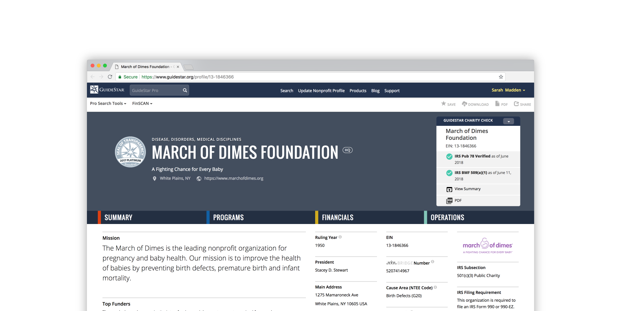
We heard a lot of feedback supporting the scheme we called "Data Density", which reorganized the sections of information into four main chunks. The layout began with a summary and then grouped information into three categories: (1) Programs and Results, (2) Finances, and (3) Operations. Our user testers liked that this structure put the most important information about nonprofits was easy to find, and that they could scan the full range of information on one single page.
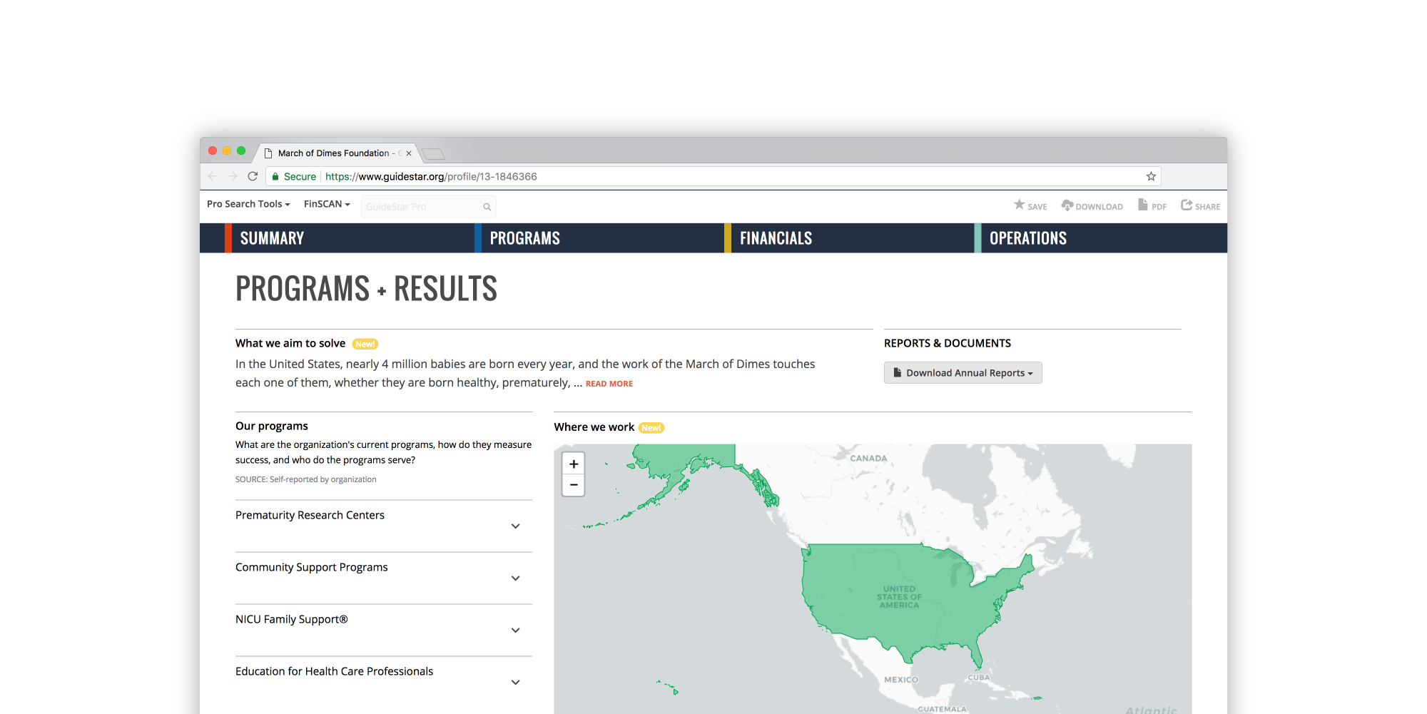
Furthermore, everyone wanted us to make the data be more visual. As a result, the new profiles share information over the entire lifespan of an organization. Users can now see organizational growth, revenue, expenditures, and funding in a historical context. Interactive graphs highlight patterns and differences from one year to the next, showing as many as 15 years of data.
MVP + iterating
Launching v1, then v2
In early 2016, we launched version 1 of the completely redesigned and rearchitected GuideStar Nonprofit Profiles.
After this milestone, we continued talking to users to gather feedback. Overall, stakeholders liked what they saw, and we integrated a few small tweaks and fixed bugs... all the while working on the underlying construction of the page to improve the responsive design performance.
In early 2017, we released a fresh iteration of the design, which focused on refactoring the code to be more modular, improving accessibility, and streamlining the design. Now, we are continuing to add accessibility features, in addition to constantly adding new pieces of data as we can get it.